Why Responsive Design Matters

The way we access and interact with the web has vastly changed over the last decade. With the advancement of smartphones, designers had to change their websites to be accessible on smaller screens. Web designers had to find a way to adapt their websites for various desktop resolutions, tablets, and mobile devices. Creating separate versions were impractical, so flexible, responsive design was born.
What is Responsive Design?
Responsive Web Design
Responsive web design is an approach that allows design across various devices. Responsive web design is about using HTML and CSS to automatically resize, hide, shrink, or enlarge websites to make them look good on all devices. Designing for optimal viewing experiences with standardized flexible grids allow for a great user experience. Whether the user is using a desktop computer or a smart phone, the website automatically switches to accommodate for resolution.
Why Responsive Design Matters
First and foremost, responsive web design makes everyone's lives easier. Web designers and developers don't have to create new websites for every platform, and users can access every site on any device.

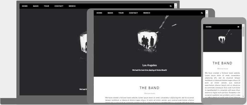
Yale's Website
Any device, any time: Whether you are using a large desktop computer from your home or using your iPhone on the go, the website will be automatically configured to your screen. Browsing an old, clunky website on your phone is not a fun task.
Optimal design: All fonts, images, and other HTML elements will be scaled in relation to your device. Simplified design and bigger text is an example of a mobile scale-up.
No redirects: Without redirecting users to a different version of the website depending on the decide, the user can access the content they want easily and quickly.
Price: One well designed website is cheaper and better than separate, dedicated sites.
Three Features of Responsive Design
Media Queries:
Responsive web designers uses CSS media queries to change the page layout based on the target device, such as display type, width, and height. With media queries, you can define completely different styles for different browser sizes.

Horizontal Display

Stacked Display
Flexible Grids:
Flexible grids are created using CSS. Web layouts consist of columns that automatically rearrange themselves to fit the size of the screen.

Responsive Layout Design
Flexible Images and Videos:
As devices change in size, images and other media types should be scalable. All assets in responsive design are in flexible containers, or grids. A simple way to make the content scalable is to use the max-width property with a value of 100%.
If the CSS width property is set to 100%, the image will be responsive and scale up and down:
<img src="img_girl.jpg" style="width:100%;">

CSS Width Property
If the max-width property is set to 100%, the image will scale down if it has to, but never scale up to be larger than its original size:
<img src="img_girl.jpg" style="max-width:100%;height:auto;">

CSS Max-Width Property
Learn More:
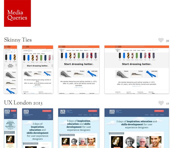
To see some responsive web designs in action, check out https://mediaqueri.es/ on your phone, tablet, or computer.
W3schools is a great HTML and CSS source: https://www.w3schools.com/html/html_responsive.asp

https://www.w3schools.com/html/html_responsive.asp
Responsive web design enables designers to maintain consistency across multiple devices. No matter what device someone is using, they will always have optimized content. Play around in the sandboxes of W3 Schools and check out some completed websites at Media Queries.